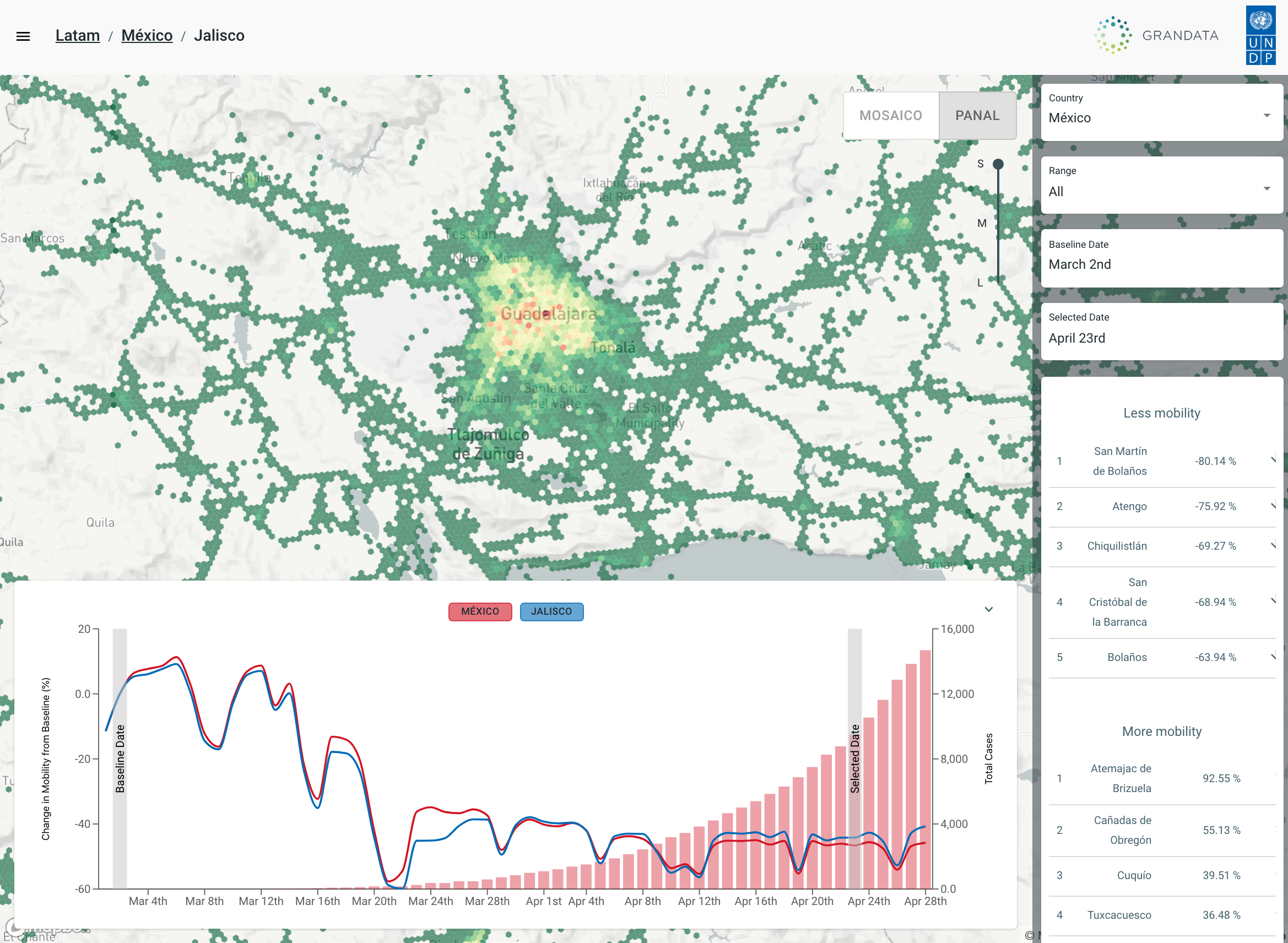
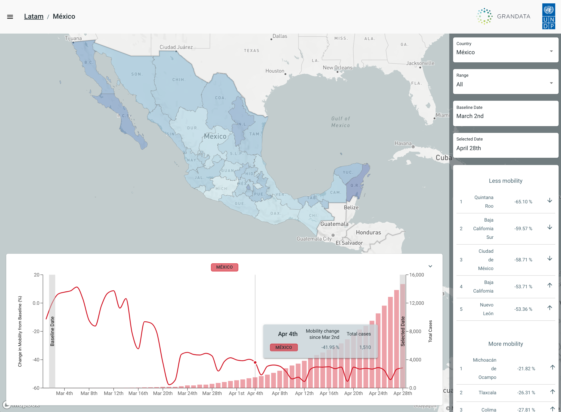
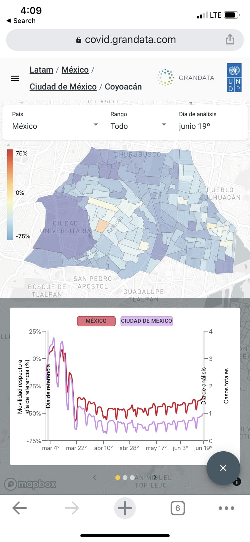
Analyze the population’s mobility, zooming-in to any province/state or district, and visualize a heatmap containing daily “out-of-home” events
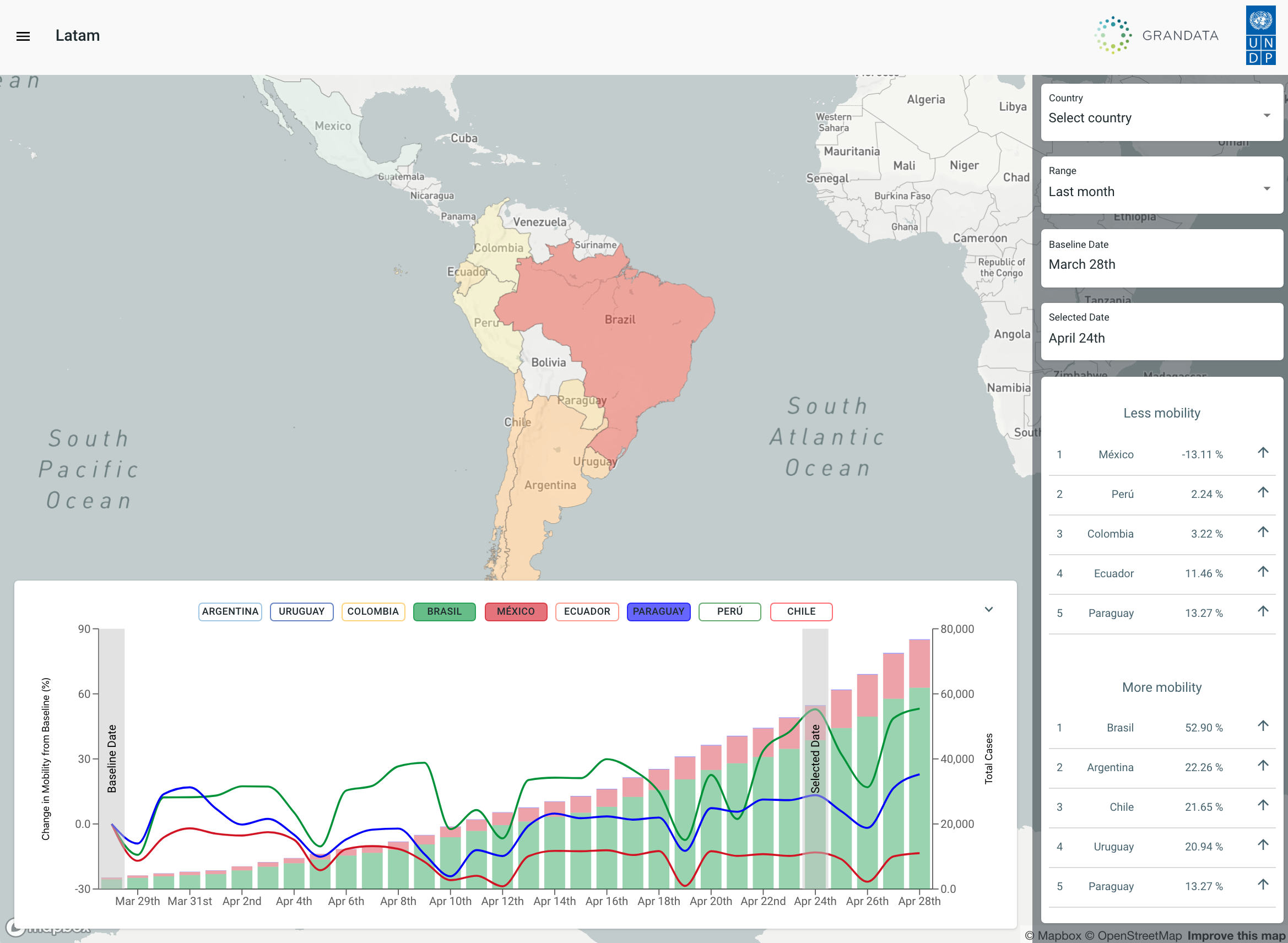
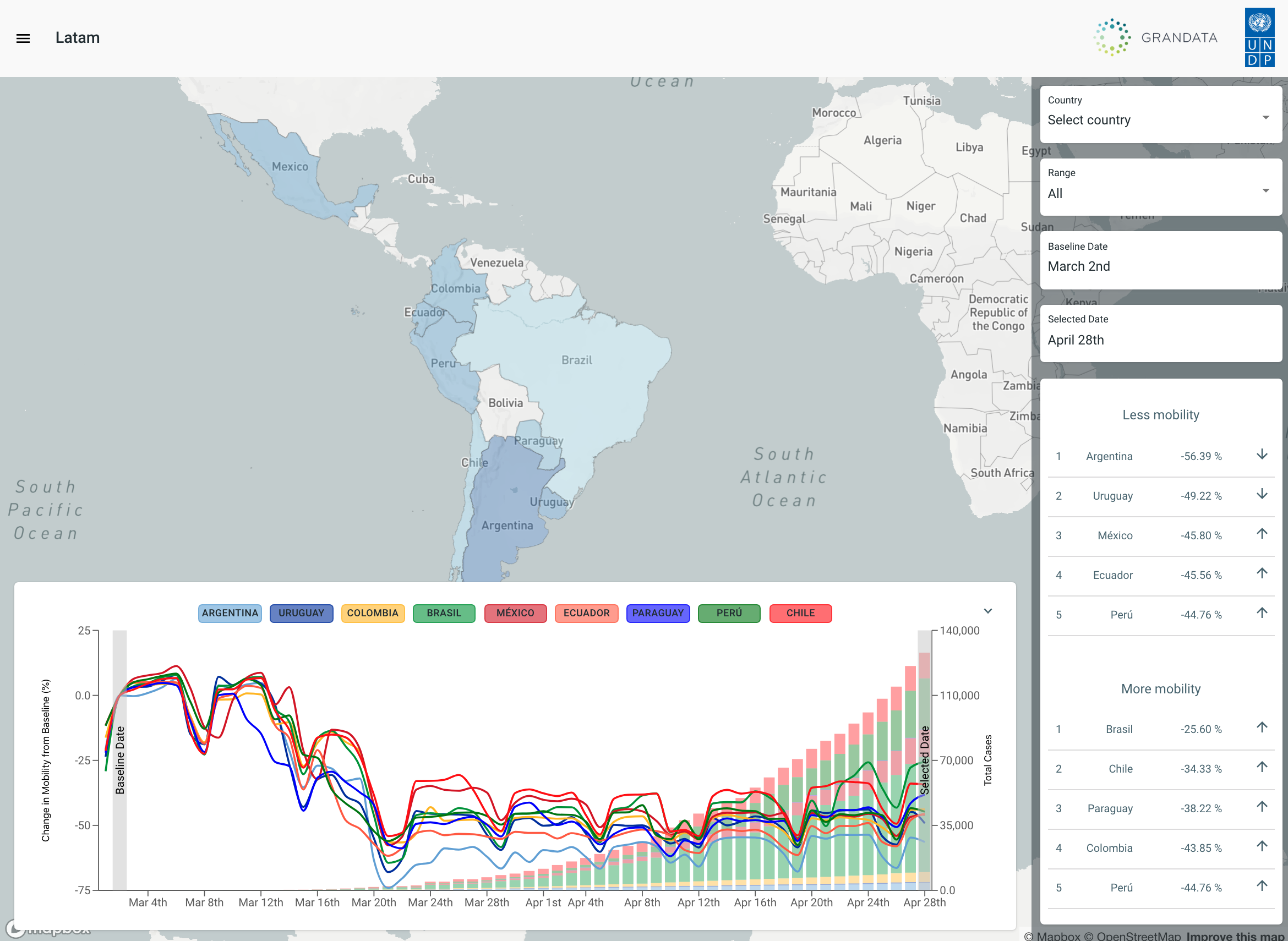
How the community within the geography is adhering to stay at home rules every day. Compare it against other regions and see the evolution of social distancing over time.
Take a look